What is DATA?
A collection of cats, such as numbers, words, measurements, observations or even just descriptions of things.
Data can be 'Qualitative' and 'Quantitative'
Qualitative data is describes something (describes information)
Quantitative data is describing the numbers (numerical information)


 But the 5th mark is drawn ACROSS the previous 4 marks:


A collection of cats, such as numbers, words, measurements, observations or even just descriptions of things.
Data can be 'Qualitative' and 'Quantitative'
Qualitative data is describes something (describes information)
Quantitative data is describing the numbers (numerical information)
Quantitative data can also be 'Discrete' or 'Continuous'
Discrete data can only take certain values (Like whole numbers)
Continuous data can take any value (within a range)
A simple way to remind: Discrete data is counted
Continuous data is measured
Example 1:
What do we know about Arrow the dog?
Qualitative:
- He is brown and black
- He has long hair
-He has lots of energy
Quantitative:
-Discrete:
- He has 4 legs
- He has 2 brothers
-Continuous:
- He weights 25.5 kg
- He is 565 mm tall
Example 2:
A person;s height: could be any value (within the range of human heights), not just certain fixed heights.
Also a dog's weight and the length of a leaf.
Example 3:
The number of students in a class (You can't have half a student).
The results of rolling 2 dice:
Can only have the values 2, 3, 4, 5, 6, 7, 8, 9, 10, 11 and 12.
Here is the video of the Qualitative and Quantitative data:
Here also another video of the Discrete and Continuous data:
-EXERCISE-
!GOOD LUCK!
Question 1:
Which one of the following is continuous data
a) She has two eyes.
b) She has five kittens.
c) She has four paws.
d) She weighs 5.4 kg.
Question 2:
The population of a particular classroom at any given.
a) Discrete
b) Continuous
Question 3:
The level of water in a measuring,
a) Continuous
b) Discrete
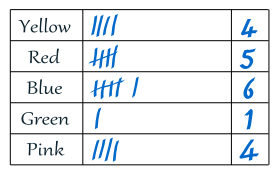
TALLY
What is Tally?

A way of keeping count by drawing marks.
Every fifth mark is drawn across the previous 4 marks, so you can easily see groups of 5
Tally Marks is easy to do a tally, just put marks on a piece of paper!
Here are the tally marks for 1 to 4:
 |
Then continue to making single marks again:
Remember: every fifth mark is drawn across the previous 4 marks
It makes it easy to see the total later on!

Here is the video of Tally:
-EXERCISE-
!GOOD LUCK!
Question 1:
Abby counted the different colored cars that passed the school gate in 5 minutes with the following results:
Red, Black, Green, Red, White, Blue, Yellow, Red, White, Blue
Make a tally of Abby's results.
How many blue cars did he see?
Question 2:
Betty recorded the letters of the alphabet in a sentence with the following results:
T H E S U N S E T I N T H E W E S T
Betty recorded the letters of the alphabet in a sentence with the following results:
Make a tally of Betty's results.
How many S's did she record?
Question 3:
Daisy did a survey of the numbers of brothers and sisters for each the children in her class with the following results:
0, 1, 5, 3, 6, 4, 0, 0, 1, 2, 3, 1, 0, 1, 5, 4, 2, 1, 3, 3, 2, 1, 0, 1
Make a tally of Daisy's results.
How many children had no brothers or sisters?
BAR CHART
What is Bar Chart?
A Bar Chart is a graphical display of data using bars of different heights.
This is the kind of survey of your friends to find which kind of movie they liked best:
| Table: Favorite Type of Movie | ||||
| Comedy | Action | Romance | Drama | SciFi |
|---|---|---|---|---|
| 4 | 5 | 6 | 1 | 4 |
We can show that on a bar graph like this:
It is a really good way to show relative sizes: we can see which types of movie are most liked, and which are least liked, at a glance.
We can use bar graphs to show the relative sizes of many things, such as what type of car people have, how many customers a shop has on different days and so on.


![[image]](https://lh3.googleusercontent.com/blogger_img_proxy/AEn0k_vf4QdZoTzJGbyIsO3OlISF3_bu2mB0UjiqPG4ndcLgEbXrn0s1FqEHlaoTmIRvKW8gv7ZPsLd4Tus2llQnzv2vPU2VJE0b1KJfWGCFNgai4iCXIX_ZUf6Vv3XLOTGQ9YlR1tLPmqyNViE-6bI3eB5Ewr18Ljo=s0-d)
FREQUENCY DIAGRAM & FREQUENCY POLYGON
Frequency diagrams and polygons
This frequency diagram shows the heights of 200 people:
You can construct a frequency polygon by joining the midpoints of the tops of the bars.
Frequency polygons are particularly useful for comparing different sets of data on the same diagram.
HISTOGRAM
What is Histogram?
A graphical display of data using bars of different heights.
It is familiar
 |

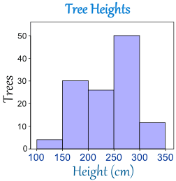
The horizontal axis is continuous like a number line: 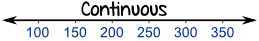
The range of each bar is also called the Class Interval
In the example above each class interval is 0.5
Histograms are a great way to show results of continuous data, such as:
- weight
- height
- how much time
- etc.
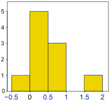
| Frequency Histogram What is a Frequency Histogram? It is a special histogram that uses vertical columns to show frequencies (how many times each score occurs): |
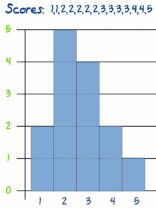 Here I have added up how often 1 occurs (2 times), how often 2 occurs (5 times), etc, and shown them as a histogram. |
Assalamualaikum sis.
ReplyDeleteGood content and great explanation. Keep it up.